
In 1981, years before the internet was a thing, I wandered into my local newsagent in Springburn, a neighbourhood in Glasgow, Scotland, looking to see if John Byrne had resumed the art on The X-Men. Byrne was my favourite comic book artist, and had been for a few years by then, from his work on The Avengers, Marvel Two-In-One, Marvel Team- Up, and a few other titles. The X-Men was the jewel in the crown as far as I was concerned. I didn’t know what happened to him after his last issue the previous year, and assumed he’d be back on the title. So it was quite a surprise to see his distinctive style on the cover of The Fantastic Four, a comic I only read occasionally, and mostly in the black and white Marvel UK reprints.
I really liked this cover. It’s dramatic in the use of angle and lighting, and like all good covers, it’s a tease of the story within. Diablo, a long-time FF villain, appears to hold the team either in thrall, or he has conjured up some voodoo-doll like effigies which he’ll use to finally defeat them. A good cover is like the cold open of a TV show, a device now rarely used, and this cover totally worked for me. In addition, it showcases Byrne’s organic, flowing linework, and good sense of composition, qualities that set him apart from other artists, as far as I was concerned at the time. What my 14 year old mind didn’t know was how good the next year and a half was going to be.


I remember being vaguely disappointed in the opening splash page – not because it isn’t good, because it’s a great splash, but because it’s essentially just a better drawn version of the cover. As splashes go, it’s an excellent scene-setter, but yeah, seemed like a bit of a cheat to me. It’s uncommon for the cover to be replicated like this, and to this day, I wonder what the decision making process was that led to it.
The other thing of note here is the inking credit. Even at 14 I knew most of Marvel’s art talent by name – Kane, the Romitas, Kirby, etc. I’d never heard the name Bjorn Heyn by then, but I was impressed. I thought Byrne’s art had never looked so good. I’d noticed the cover was by the X-Men pairing of Byrne and Terry Austin, and that’s what I expected to see on the inside too. This looked very promising, much different to the slick look I’d grown used to over the prior few years from the X-Men to Starlord, and others.

Page 2 is something that I grew increasingly spoiled with as a fan of John Byrne; his attention to the small stuff. We might not like the truth of it, but we are mostly identified by the small, mundane details surrounding us. Our clothes, our hair, the way we talk. Unless we’re pro athletes or media stars, we’re regular people, and Byrne’s genius in those days was using small detains to add colour to the stories and the characters in them. The lighting in the hallway, the cat rubbing up against the landlady. By then I’d seen these cheap little apartment buildings in shows like Starsky & Hutch and Kojak a gazillion times, so I was already invested. From a storytelling aspect too, the little details stimulate the mind of the reader. Byrne could have set Diablo’s “HQ” in an underground lair, or a warehouse, or something equally predictable, but this makes me wonder why Diablo chose this building, not why Byrne chose it, and that’s good writing. Let the reader imagine the rest for themselves.
Another thing I enjoyed: Diablo is a skinny guy wearing a costume that has folds and wrinkles. A great contrast to the rippling muscles that is a staple of the superhero comic book. And it didn’t look dumb, it looked naturalistic, looked right. After the glossy contemporary look of the X-Men, seeing a Kirby design done well was something new and exciting to me. I should say that at this point in my life I was not the Kirby fan I am today.

Some more great background detail in panel 1. I wonder how many artists of the time would have opted for a larger establishing shot of the construction site, or simple sketched one in. Under Byrne’s expert draughtsmanship, he packs a lot of detail into that tiny panel.
Th meat of this page is that Sue is getting a hairdo. The “Veronica Lake” look is something she’s sported since the early 70s, and to be honest, I always liked Sue’s long blonde hair. Combined with the absence of mask, it added to the more down to Earth aspect of the book. At this point I wasn’t so concerned with what she’d look like, but on the girl in the middle panel. I recall that in those days of raging hormones, I thought John Byrne drew THE best looking women in comics ever, and now that I think about it, maybe his art is what made me a boob guy, and not a leg or bum guy … curious …

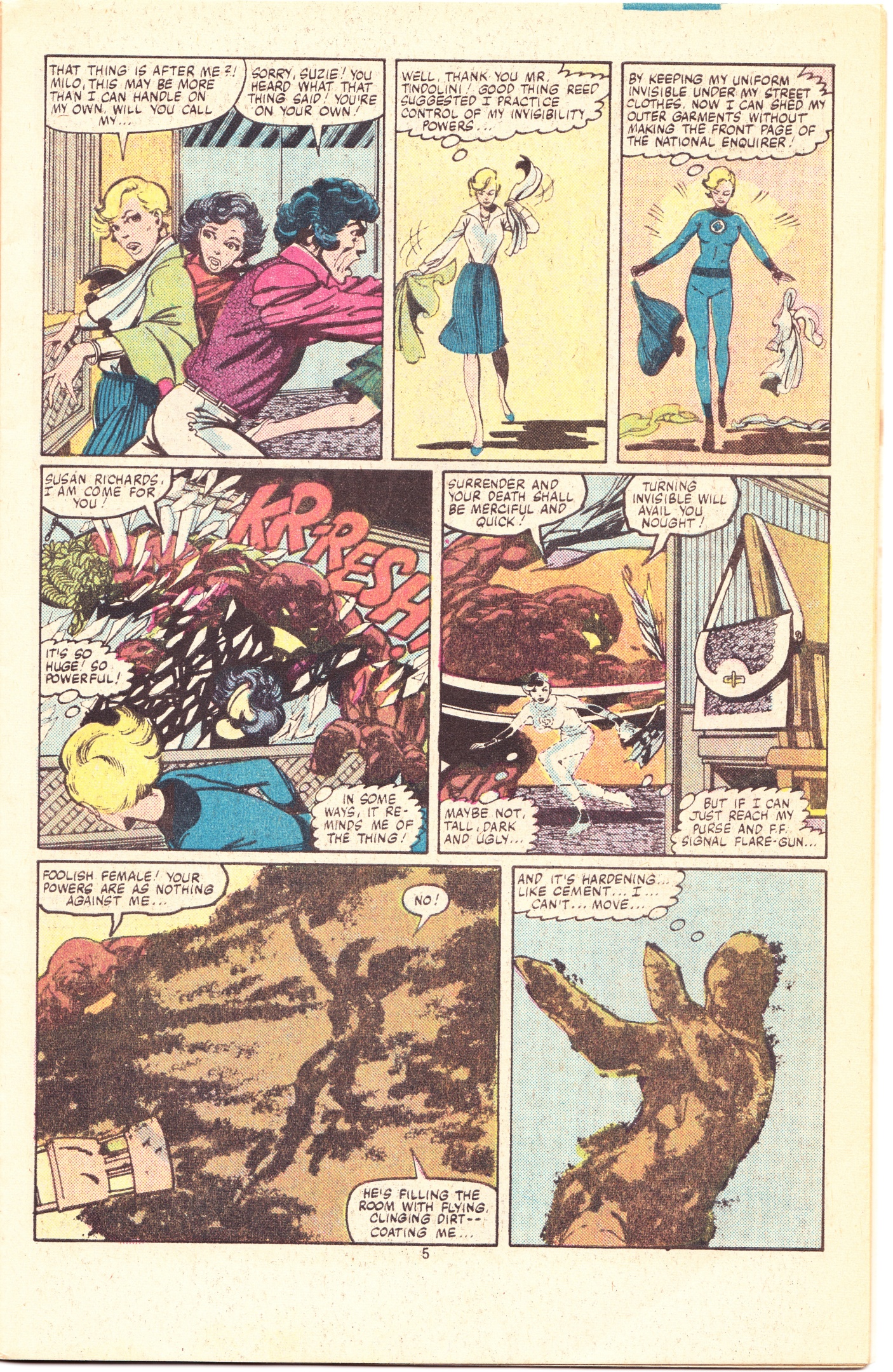
Turns out, I both hated and appreciated Sue’s new haircut! I think it’s a dumb style even to this day. I absolutely did not like it at all, from a purely aesthetic point of view, but I did notice the change in Sue immediately. For all the years of reading the FF, I always considered Sue to be a mother-and-wife-in-a-costume, especially because that’s how she was written. Suddenly, with the haircut and personality tweaks that Byrne implemented on this page, Sue became a more realized individual female character than at any time I recalled seeing her. The earth monster design is typical of Byrne: chunky and powerful, with brutish presence – something he’s particularly good at, but wasn’t able to show much of during the X-Men years.

Speaking of chunky monster physiques, here’s our first in-story appearance of The Thing, and the date night scene is a nice callback to the early days of the Lee/Kirby run when he would wrap up in stuff from the Big and Tall section of the department store just to go out. Like many details in this run, Byrne didn’t invent them, but he brought them out of mothballs, blew the dust off them, and made them part of the FF again. I always liked The Thing, and he always felt familiar to me from my love of American movies and TV set in the Noo Yawk area. He was a character that I always found east to get; blue-collar tough guy that would do anything for a pal. This page also showcases another example of Byrne’s “organic” penciling. That water bubble looks like a water bubble with its shifting, amorphous shape and highlights. I wonder how many artists would just have drawn a sphere.
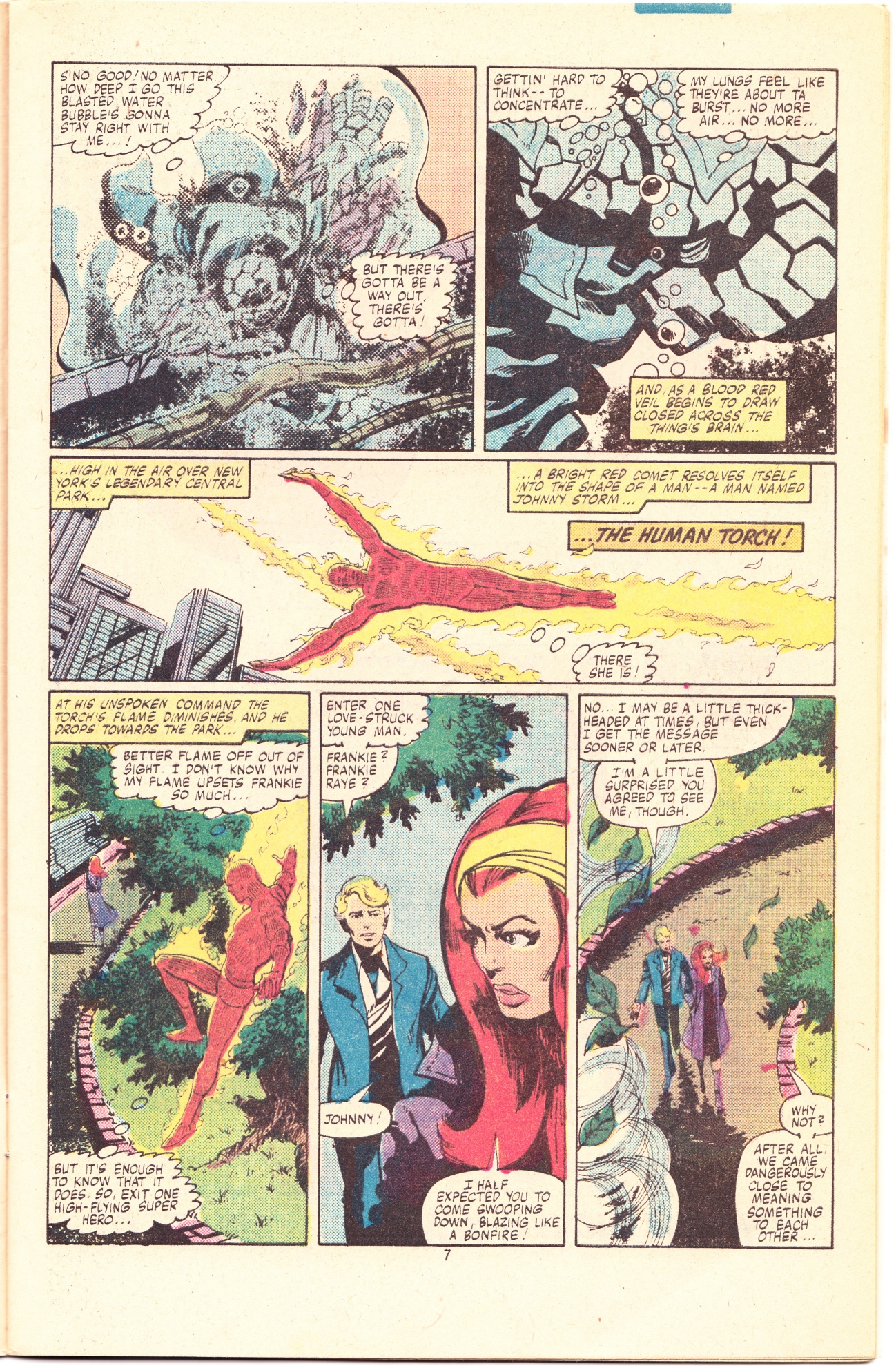
From The Thing to the third member to appear, The Human Torch. Another thing Byrne excelled at is in how his flying characters don’t just fly, their body language shows a comfort level, a feeling that to them, flying is as natural as breathing, and that’s important. They don’t just fly to get from point A to point B. They’re not taking the bus, they’re driving a sports car. That’s an important detail to consider in both the writing and drawing of flying characters. How a character behaves affects their personality and body language and vice versa, and back in these days, Byrne was adept at this. I recalled the Frankie Raye character from previous uninteresting appearances in 70s stories, so her appearance didn’t strike me one way or the other here.


One thing I’ve never been so keen on with Byrne’s writing is, ironically, his character writing ,specifically in his dialogue. When I said his background detail is great, that greatness is drastically reduced by his writing ability. Johnny Storm and Frankie Raye are what, early 20 somethings, but their dialogue and behaviour is straight from American TV melodrama not from observational detail. It’s better than cookie-cutter comic book standards of the era, but flat, lifeless, and cliche when using the same standards I applied to Byrne’s art. Neither The Torch or Frankie seem like they would be fun to hang out with, and therein lies the main problem with Byrne’s characters, they mostly feel shallow and inauthentic when he has to write these small scenes that bridge the action. Which isn’t to say Byrne doesn’t “get” the characters. In fact he does, he just doesn’t have enough talent as a writer to escape his obvious pop culture influences.

And speaking of getting the FF, he took what I’d always considered a fairly bland character in Mr. Fantastic and turned him into an interesting guy fit for leading the team, not just by means of him being smart, but also being pragmatic, and less of a “superhero” type. Admittedly, I think Byrne accomplished this more visually than previous artists by using a looser-fitting costume. I always expected he would do more than he actually did with all of the characters, but he treats them all as very different individuals in a way that instantly recalled the first few years of the Lee/Kirby era. And going back to the “organic” description I use here for Byrne’s fluid penciling, Mr Fantastic is a character that’s ready made for this, as much as the sentient blob of water we left The Thing trapped in. I really like to focus on the details on this page, such as the casual ease of Reed reaching across the room to open the windows, and in the writing for even mentioning these little details. It makes me feel like we’re in a place where people live, not just an HQ where meetings are held.


Panel 3 is my favourite here. I’ve been to New York City many times by now, and Central Park is one of the dearest places on Earth to me, but I can’t go there without being reminded of Byrne’s effective – and deceptively simple – method of drawing buildings. As a reader, I think I’d have liked to have read this story without the superior position of knowing who was behind it all, because each time Reed’s internal monologues come up you’re not along for the ride, you’re waiting on him to catch up to you.


I got a little chuckle as Reed’s evaluation of the elemental enemies’ overconfidence as being a potential weakness. And he’s right – Byrne’s on-the-nose villainous dialogue is given the perfect context here by Reed. Sure it’s likely an accidental meta subtext, but it’s a fun little detail even so. Less accidental on Byrne’s part is shown on this page and the next in his depiction of The Invisible Girl, as she flees from the Earth elemental that disrupted her hair appointment. Hey, maybe that’s why it looks half-finished!

Even from the early days of the Lee/Kirby run it’s clear that in order to prevent the book from becoming the Fantastic Three, Sue’s role needed to be beefed up. The trouble with invisibility as a super power is it’s visually uninteresting, and compared to the three men in the team, simply turning invisible isn’t so great either. I forget which issue first saw Sue being coached by Reed to use her power to actually form invisible objects (maybe the first appearance of the Molecule Man?), but that was the key. Here Byrne adds a layer of self-awareness to Sue as she cites Ice Man of the X-Men as an inspiration for developing her powers, not just being told by Reed. A good, small step in John Byrne’s pretty great transformation of this mostly passive character. Great too is the tiny scene in which two bystanders take action to save The Thing’s life. Byrne could have gone the easy route and have Ben simply grab a scuba tank himself, but this small scene adds a LOT of humanity to the story – again, it’s these tiny little details that are actually huge upon closer inspection. It’s one of the only true acts of heroism in the entire issue, when you think about it, with the other being on the next page when Ben selflessly returns the favour and saves the life of the drowning girl. Really liked how this came after the store owner revealing there was only one working tank, because it wasn’t the same kind of decision made by the girl – it turned Ben’s decision into one of self-sacrifice, not just two people scratching each others’ backs.

And this page is a good view of how visually different The Thing is of this early part of Byrne’s run. In Byrne’s previous depictions, he stuck to the style guide that depicted The Thing as a recognizably humanoid male, a look that Byrne would go on to disparage as being a “teddy bear”. Accurate or not, what Byrne did from the get go was draw The Thing with a more obviously monstrous apperarance, very much in keeping with the 50s/60s monster comics that the Fantastic Four came from. I remember loving this changed visual, especially in how it allowed the angular structure of Ben’s rocky hide to show a wide range of dramatic use of shadow.

Until reading this issue for the purpose of reviewing it, I hadn’t noticed before that in profile, Ben’s head is structured similarly to that of a great ape, such as a chimpanzee or a gorilla. Could have been intentional on Byrne’s part, but if it was, I would have preferred the rest of the body to be similarly influenced. I also remember my 14 year old mind being appreciative of Byrne’s depiction of Sue in panel 1. Now look, you might find that to be embarrassing admission, and you know, I do too, but if you can’t look back at yourself and laugh …


With the issue fast approaching its climactic battle, and with three of the fantastic foursome now united, Byrne introduces some actual science into the story, appropriately funneled through Mr. Fantastic. Having correctly deduced the elemental nature of their attackers, it’s a simple matter of him using high school science to defeat them, instead of escaping to the Baxter Building to whip up some doohickey that would look good in the comics. Another small detail of Byrne’s that I liked here, not just Reed’s preference for the low-fi approach, but also showing Reed isn’t above getting his hands dirty when he grabs the generator leads to defeat the water elemental, instead of just barking out an order to Ben.

Continuing on that thought, I also liked how Byrne allows Ben to express his intelligence. As most of you know, Aunt Petunia’s favourite nephew ain’t no dummy, and being transformed into a hulking brute with an orange rocklike epidermis hasn’t made him a dummy either. Before his transformation into The Thing, Ben Grimm was a renowned test pilot, and here all Reed has to do is mention the nature of the elementals and Ben grasps how to defeat the earth elemental that’s pounding him into the pavement; by unearthing a buried water line and dissolving it to mud.


Sue, however, needs to be coached – she doesn’t have the same backgrounds as Reed or Ben, but Reed has grasped the potential her power might be capable of, and turns to her, coaching her (and the reader too) on the science of matter at different pressures. This is likely an intentional callback by Byrne to that early FF scene I mentioned previously.
As I reread this issue, it struck me that as a bystander, watching the water and earth elemental’s defeats would have that justified sense of defensive, kill-or-be-killed urgency, but once the air elemental is captured in Sue’s invisible force-field, the only way to defeat is to crush it slowly to death. As Reed explains to Ben, the elementals were not truly alive in the classic sense, but of course reed can’t possibly know that for sure, having only been able to speculate about them at every turn so far. It’s not presented here as having any real moral ambiguity, especially after Reed mansplains it away to Ben, but I like the fact it’s still a cold way to dispatch an enemy, and kind of unexpected in a book of this era, outside of Frank Miller’s Daredevil. Remember folks, this was before Marvelman.

So where’s The Human Torch been all this time? He’s still tangling with the fire elemental that Diablo sent to face off with Reed!

This page is a good example of Byrne’s obvious love for flying characters, and the visual flow of the narrative is playful and exciting in terms of layout, and really not unlike the kind of airborne action that can only be captured today using CGI. Long time fans of Byrne’s work can see a familiar pose in panel four – he used it in West Coast Avengers and Namor, to name but two. Also, another little scene showing Byrne’s understanding of these characters in this confrontation Johnny has with the elemental that speaks to the character’s own scientific smarts: not only is he a part time race car driver, but also a mechanical and electrical engineer, and as the elemental’s pomposity begins to get the better of it, Johnny sees his own opportunity to defeat it using the scientific method. I don’t know if you can see it in the scan but the face of the elemental in panel 5 is a great little example of this particular foe’s overconfidence.

With a deduction in keeping with his own background, and one that another writer might have relied on Reed to provide, Johnny uses his “nova flame” to consume all of the surrounding oxygen, thus starving the fuel needed by the elemental to survive. The brief sequence that ends this page made me think of the scene all the way back in FF # 1 when the team are grouped together after witnessing the human torch fall from the sky after over exerting himself. Again, could be an unintentional coincidence, but if not, it show’s Byrne’s full grasp of the material and his skill as a superhero comic plotter. I also liked the obvious contempt Reed has for Diablo in comparing him in unflattering terms to Doctor Doom – it makes me think back to how Diablo was holed up in a shabby apartment building and not even a low-grade den; he’s simply just not that good of a villain in terms of menace. I really liked how that one phrase of Reed’s established a ranking in Reed’s mind as to who they need to really be wary of, and whom they can beat with lesser effort.


The issue is wrapped up all neat and tidy, in a somewhat anticlimactic fashion. Since Reed figured out Diablo was behind the elemental attack, and having seen how much of a threat Diablo is, we never get any end confllict with the issue’s Big Bad. Instead, Reed recruits Dr. Strange to provide a little assist in mystically locating him just as tries to flee the coop, a humiliating fate for a super villain, as evidenced by Diablo’s Dr. Smith-like utterance upon his capture: “Oh the ignominity!” It’s the kind of comeuppance that was unexpected at the beginning of the story, but not too surprising given Reed’s summation of Diablo on the previous page. It’s worth noting that Byrne draws a terrific Dr. Strange, and it’s a real shame that he turned his talents to that character during his time at Marvel beyond the odd guest appearance.
All in all, I remember thinking this was a great little read, and it wouldn’t take long until The Fantastic Four became a much better book to me than the X-Men ever was, even with all those terrific, groundbreaking storylines.
Tune in next time for my review of Fantastic Four 233.


SPECIAL BONUS PIN UP, TRUE BELIEVER!
This is my hand drawn recreation of the cover, full size 11 x 17 on Bristol board, using the grid method of scaling.


Pingback: COMIC BOOK REVIEW – FANTASTIC FOUR 232: “BACK TO THE BASICS!” – movies
Pingback: COMICS TESTIMONIAL– WONDERFUL 4 232: “BACK TO THE FUNDAMENTALS!” | Movies Games n More